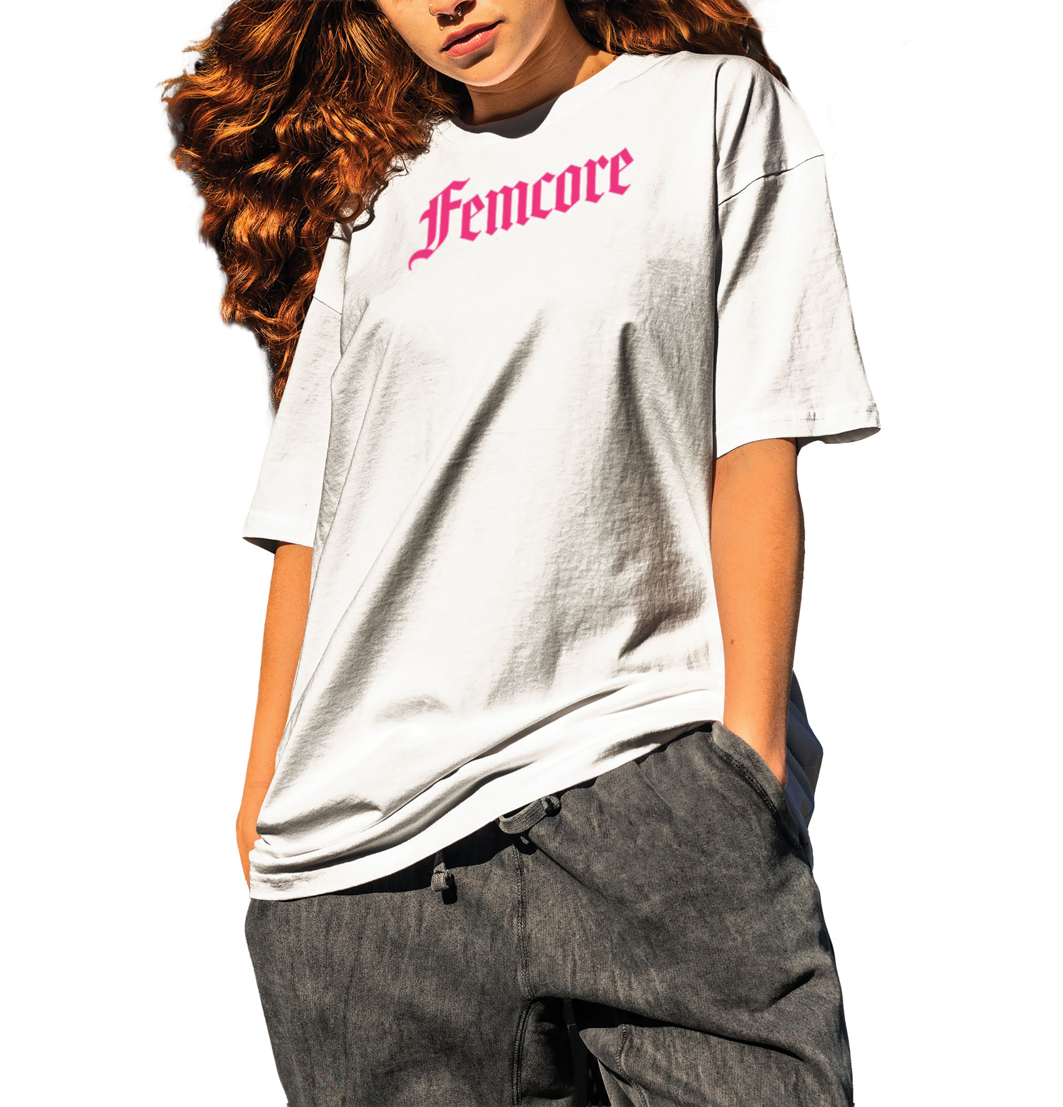
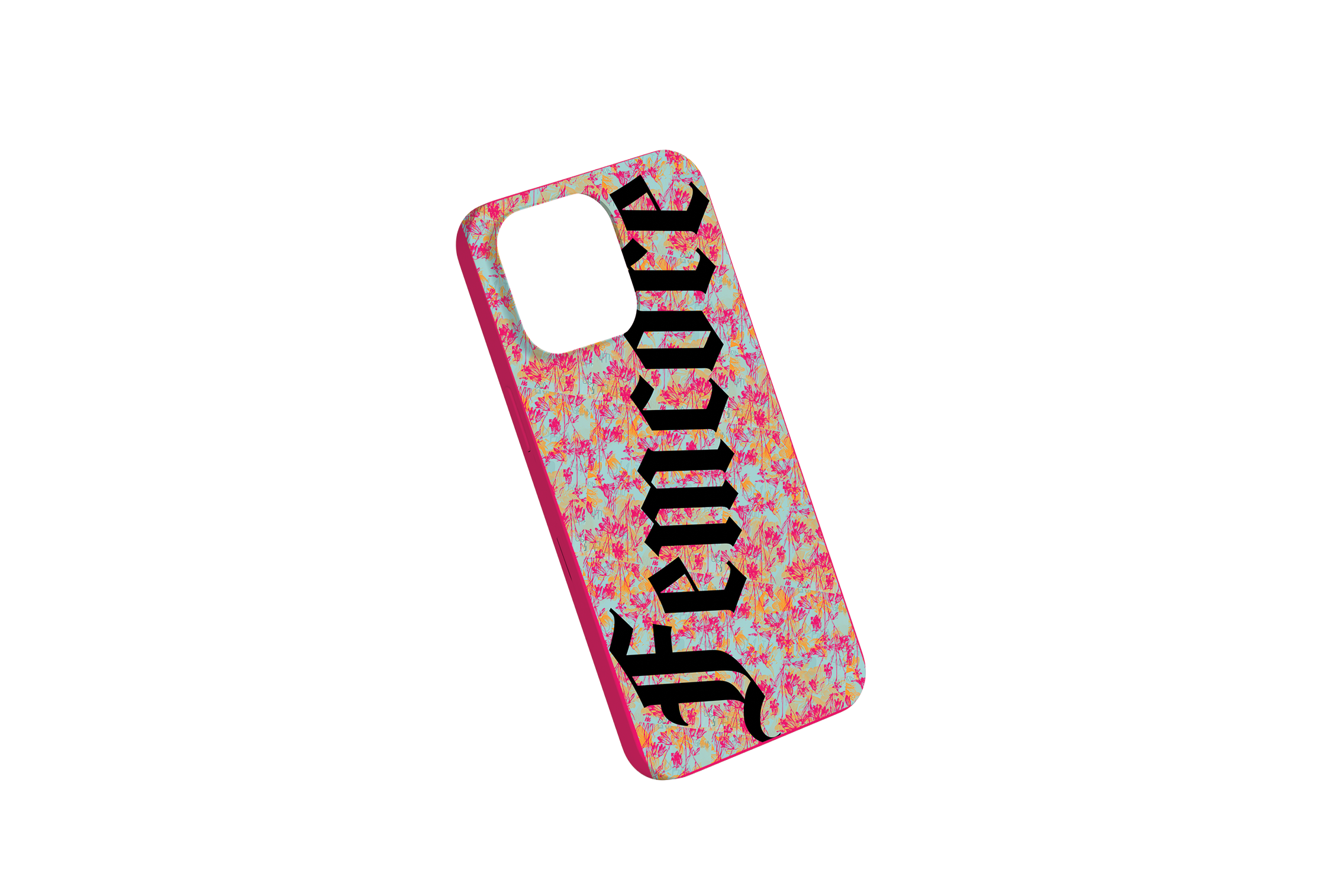
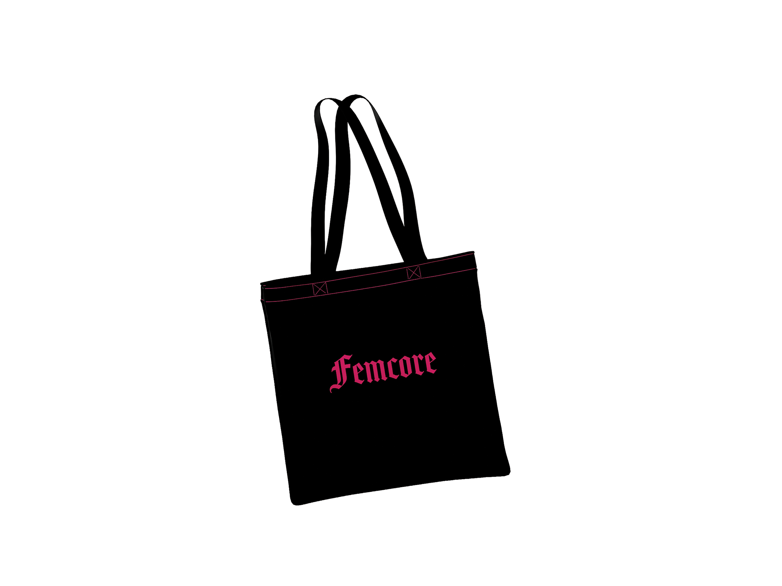
Femcore
Brand Identity
Brand Guidelines
Editorial Design
Women’s Skateboard Association
Corporate Thesis
Software
InDesign
Photoshop
Illustrator
ProCreate
Acrobat
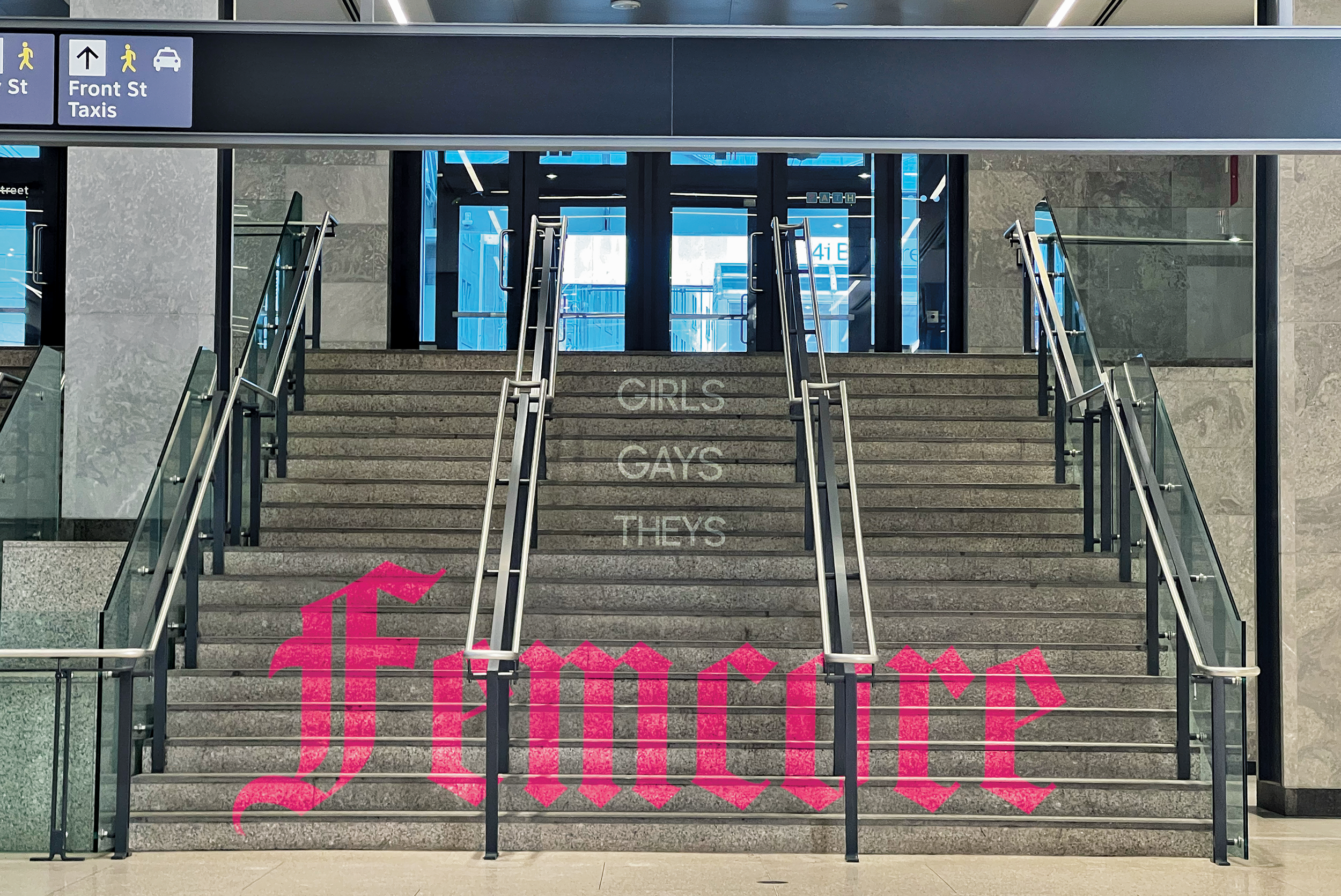
For decades men dominated skateboarding. Women and LGBTQ+ skateboarders still seek a safe skateboard community, and want to see more of skaters like themselves represented in the media. The design challenge was how do we create a skateboard brand that women and LGBTQ+ people can identify with, have community, and feel accurately represented?
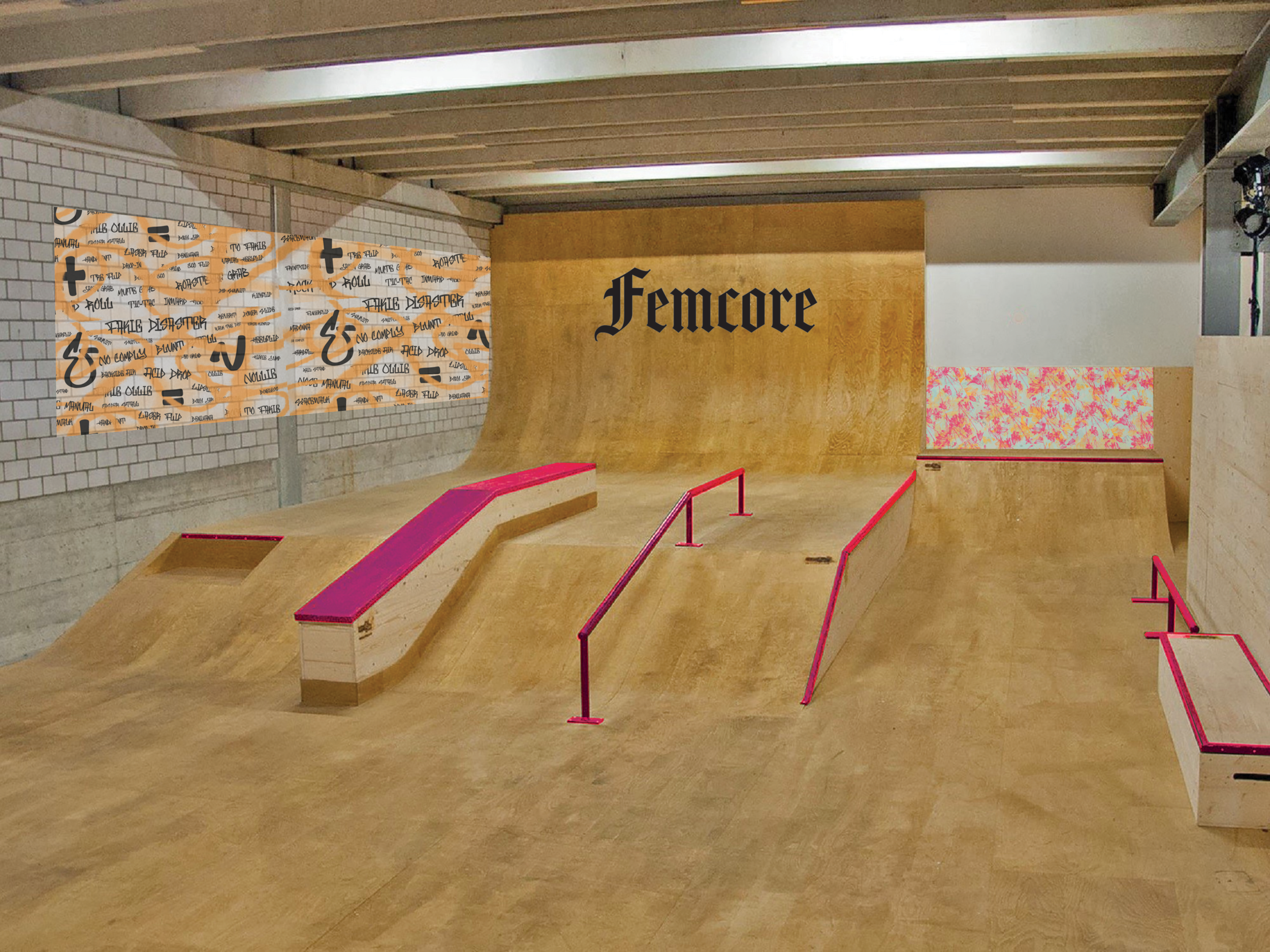
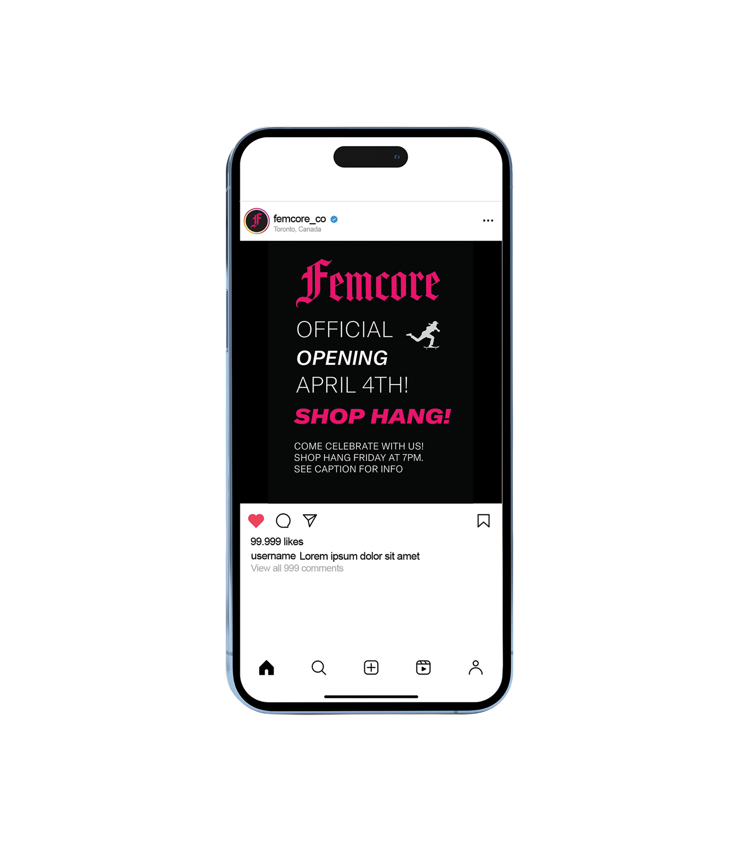
The key outcome was a female run skateboard shop and brand, opened in Toronto, Ontario. And a special edition editorial, that shares the frequently unknown history of women and LGBTQ+ people in skateboarding.
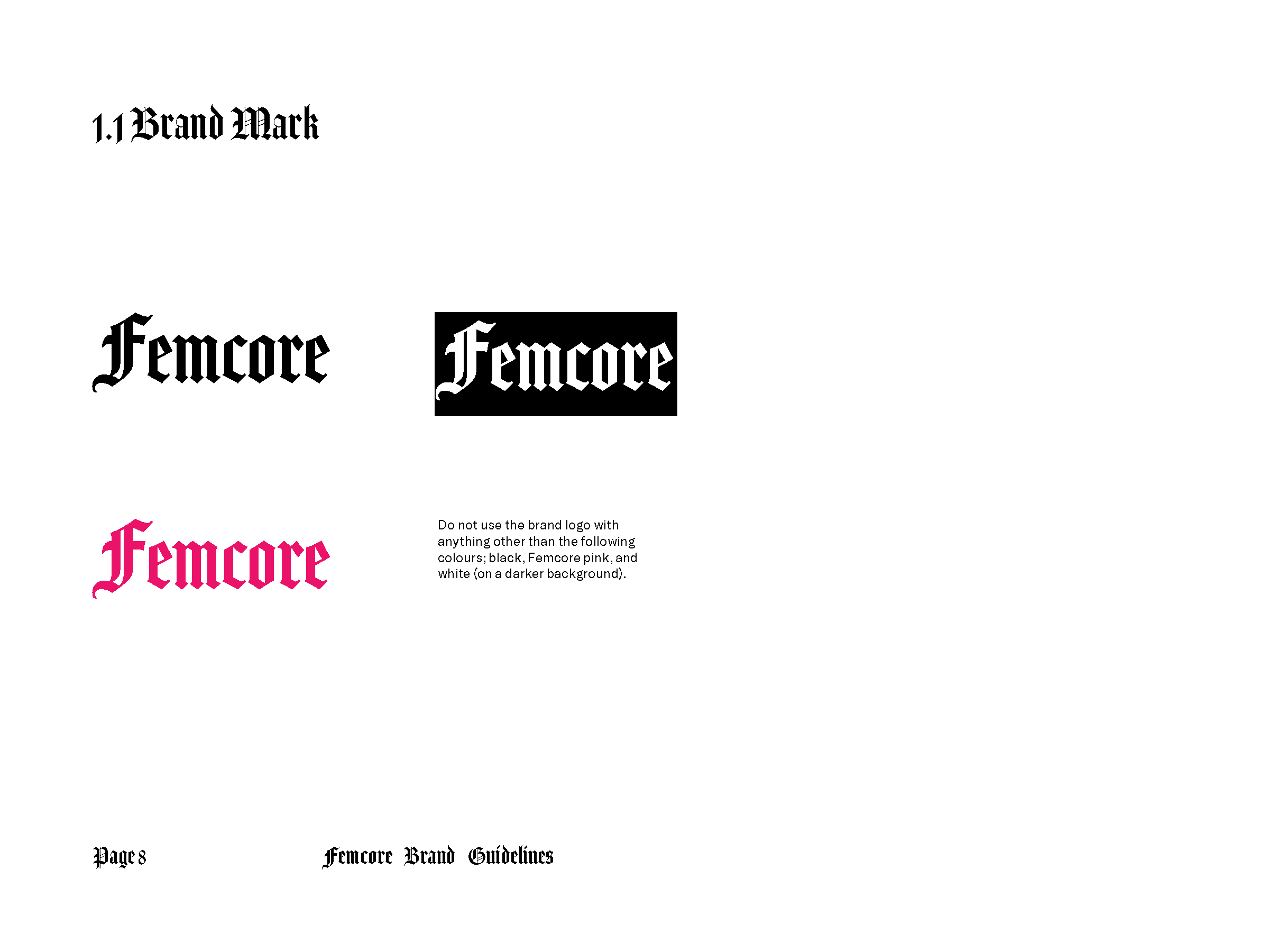
Fuchsia is the primary colour. It emulates strength, new ideas, and attracts attention. We wanted to redefine how people see femininity — that strength and femininity can fuse as one. That strength is a feminine characteristic.
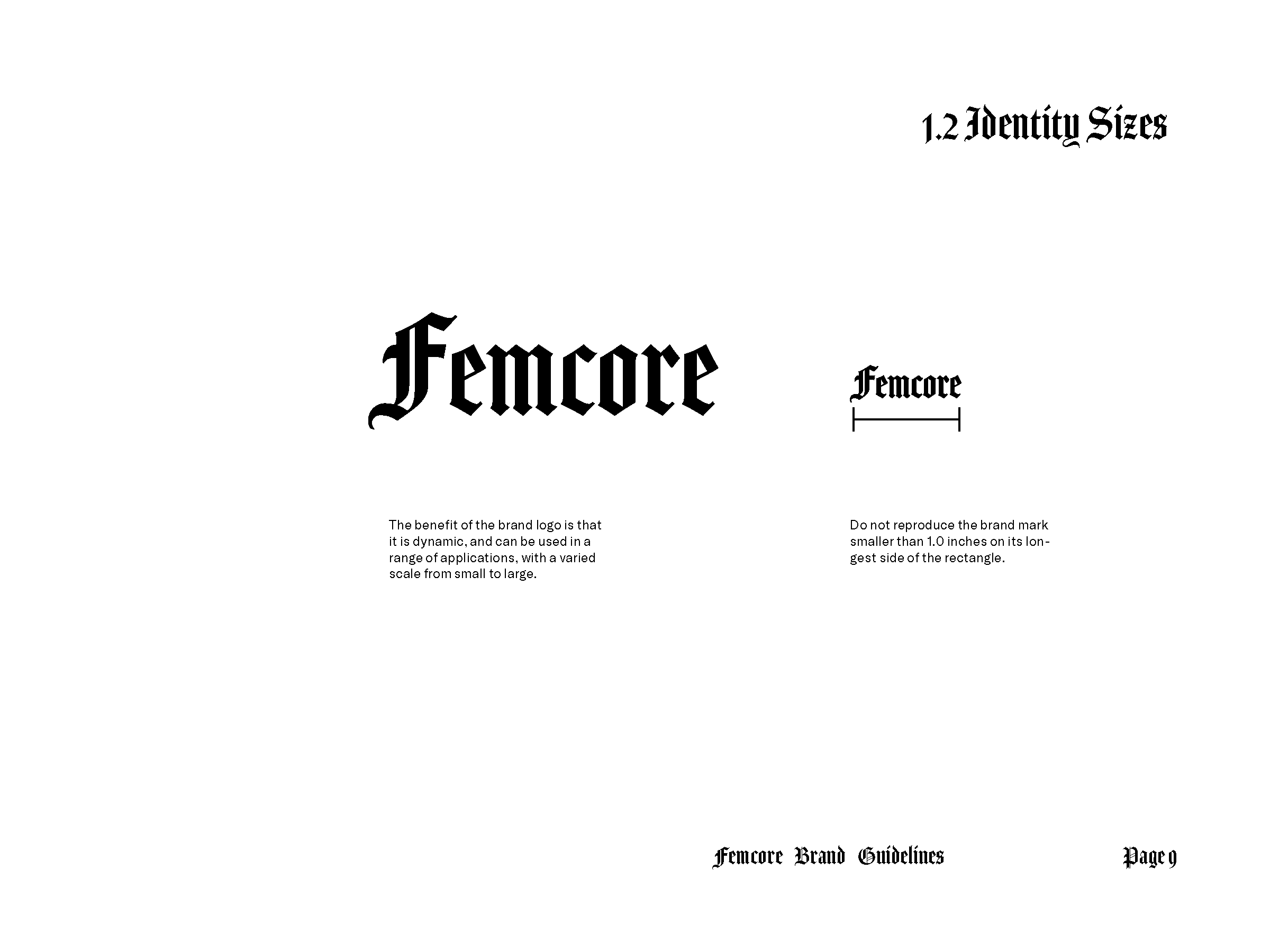
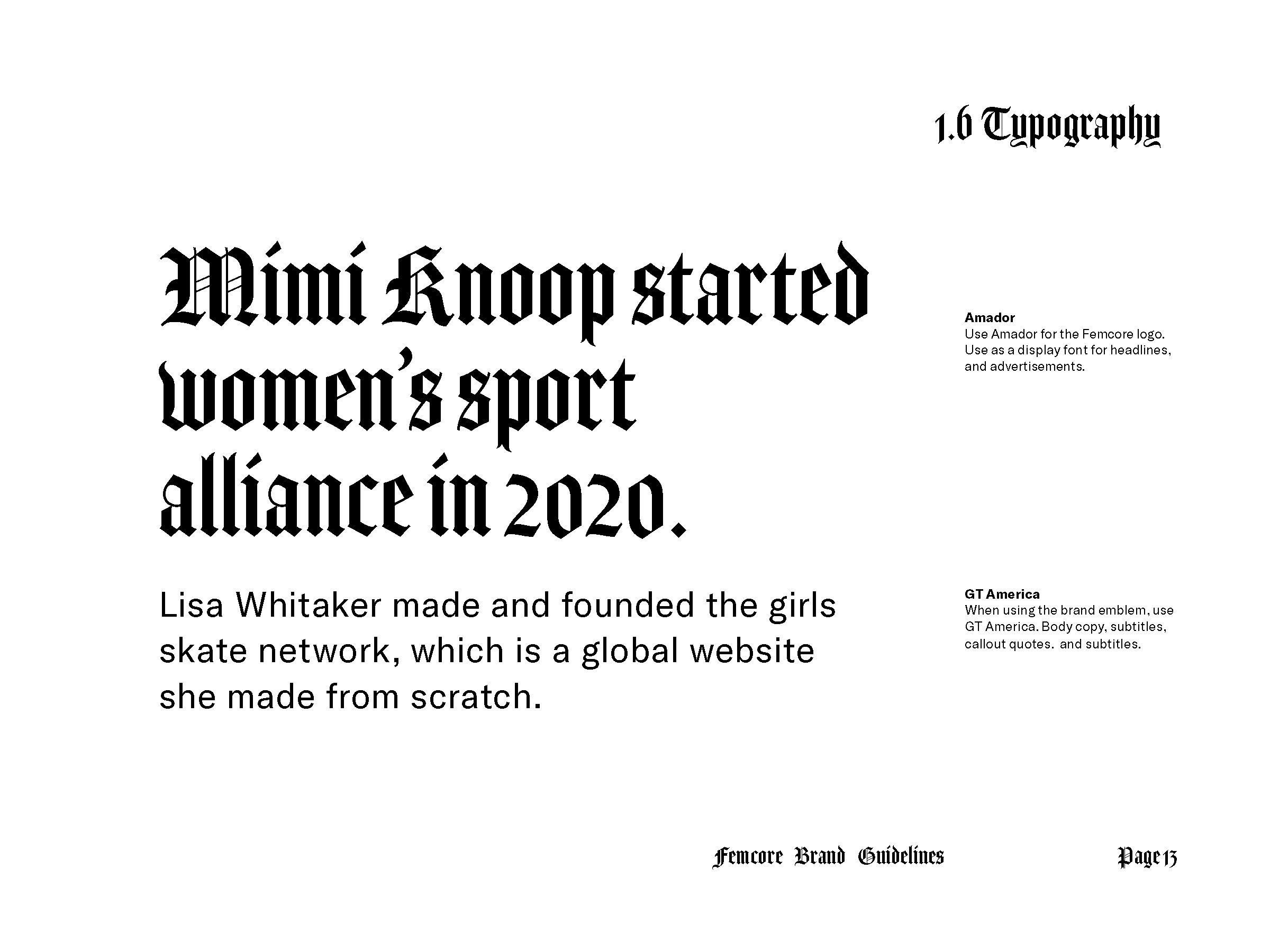
Amador combines both thick and confident strokes, with angular detail for a softer contrast. The typography makes the brand bold, artistic, and unapologetically itself.
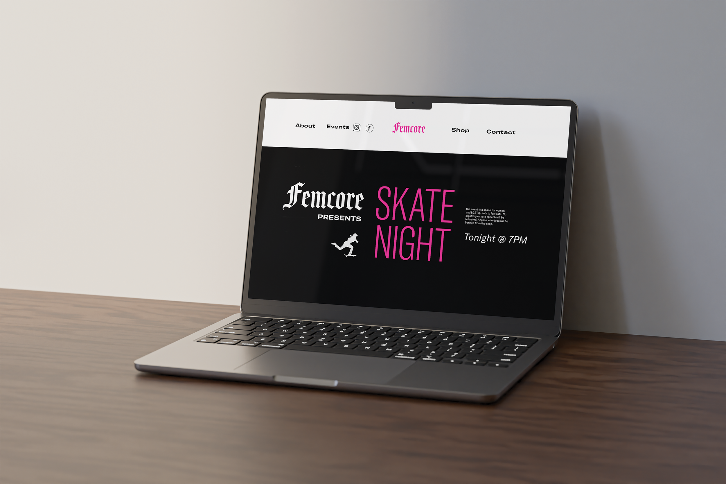
The result was provides more safe space for women and LGBTQ+ skaters through Femcore and its applications. There is an instagram community, website, indoor skatepark for leisure and lessons, a skateshop, magazine, and varied brand merch.
Sample of Brand Guidelines Pages